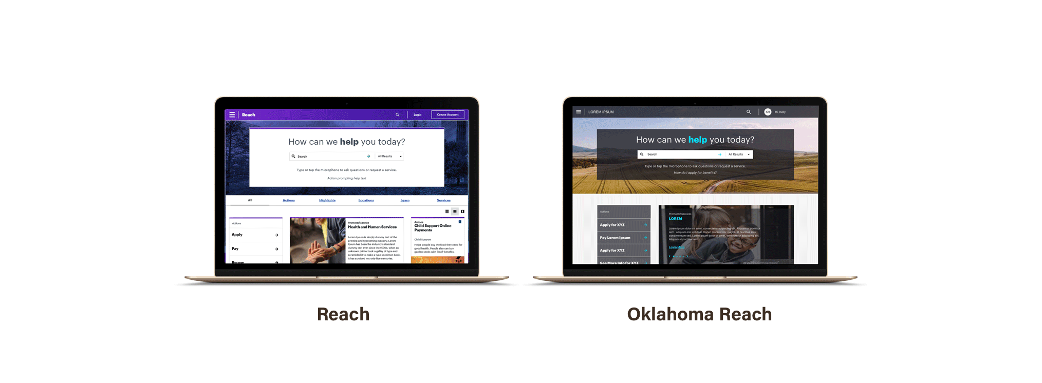
REACH PLATFORM & DESIGN SYSTEM
Accenture | 2018
MY ROLE
My role included developing user personas, user flows, and immersing myself in the application process to better understand what the end tool needed to solve. I also created wireframes and designed the initial UI for the white label design system which laid down the foundations and informed the final product.
MY TEAM
UX Designer
Product Owner
Project Manager
Scrum Master
On-shore Back-End Development Team
Off-shore Back-End Development Team
QA Analyst
THE CHALLENGE
To create a Proof of Concept demo with a white label design system and leverageable responsive web assets to be used in state level human services agency’s citizen and employee portals, applications, and intake systems. The design system needed to be built on Angular Material, be HIPAA and ADA compliant, and also follow WCAG AA accessibility standards.
Although our stakeholders had a solution in mind, we searched for the problem. Our stakeholders were directors of state department government agencies. They believed that pain points in the application process could be simplified through a customized digital tool uniting different departments and streamlining the process for government employees and citizens. Starting from scratch, we hosted a workshop with our stakeholders to build a foundational direction.
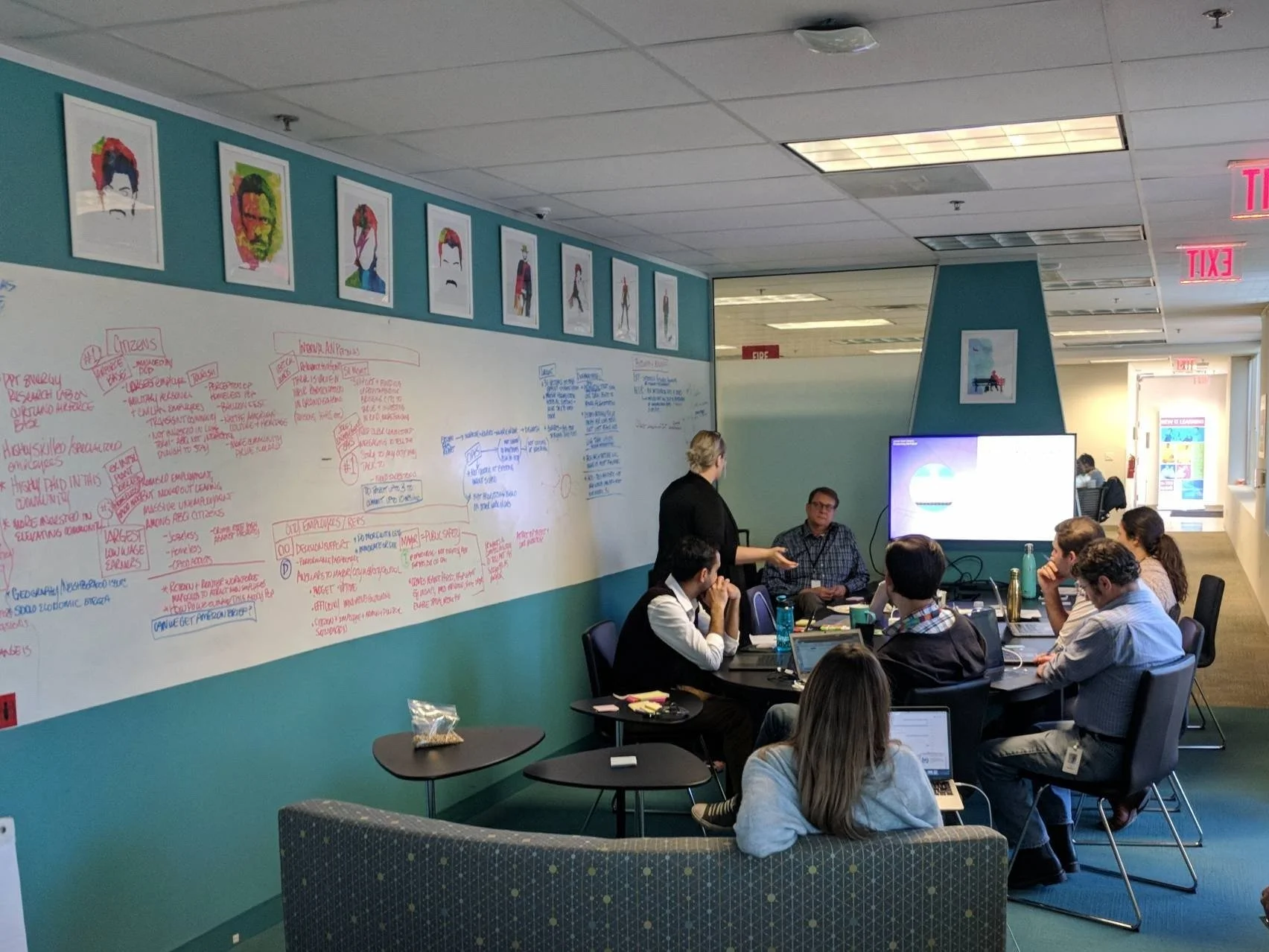
WORKSHOP
Starting from scratch, we hosted a workshop with our users, designers, engineers, and stakeholders to build an informational direction.
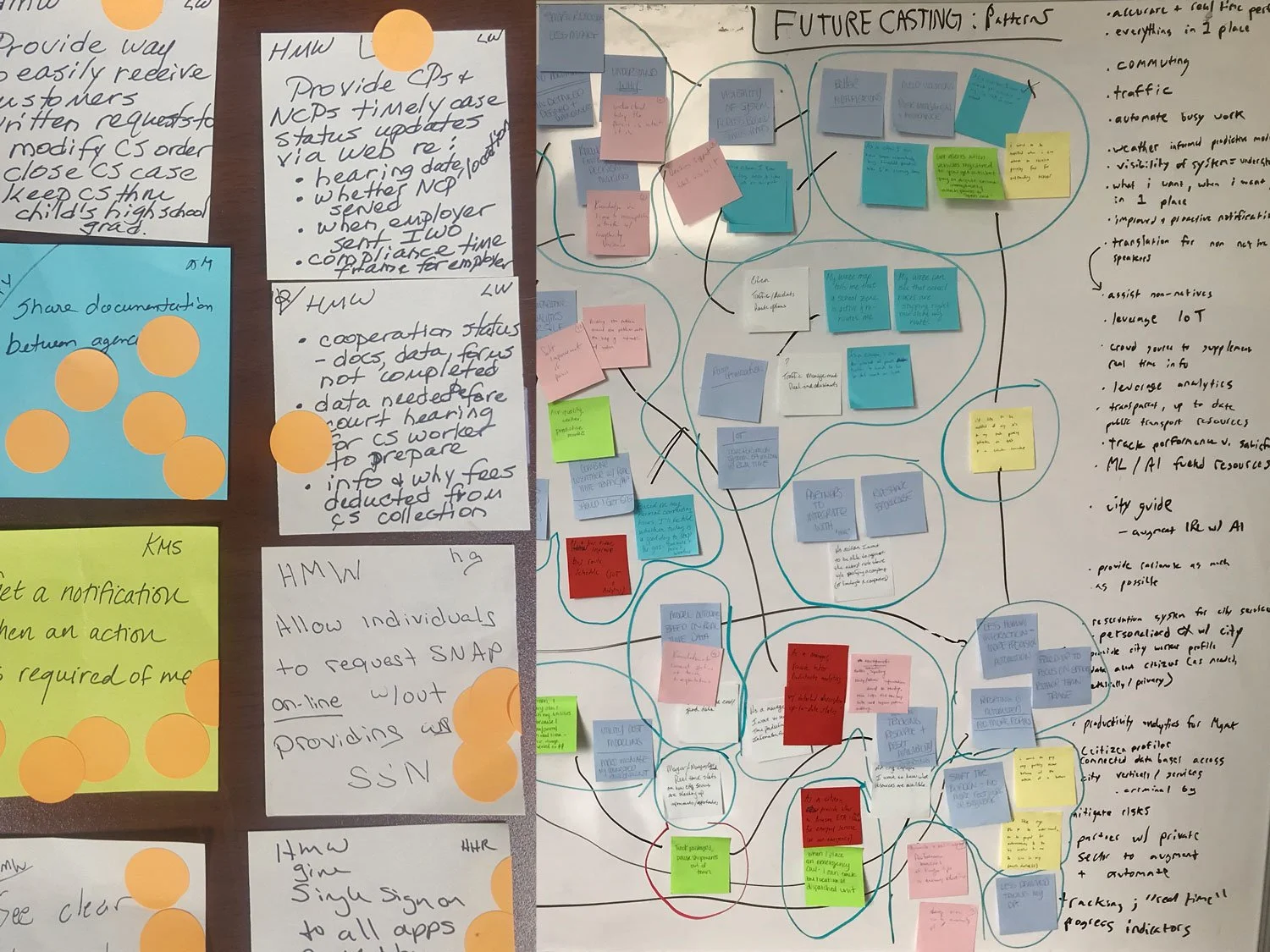
During the workshop we brainstormed potential user personas, user statements, and product features.
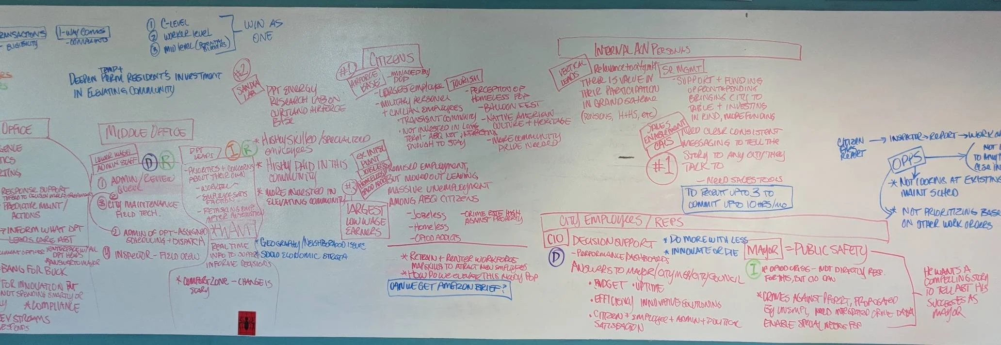
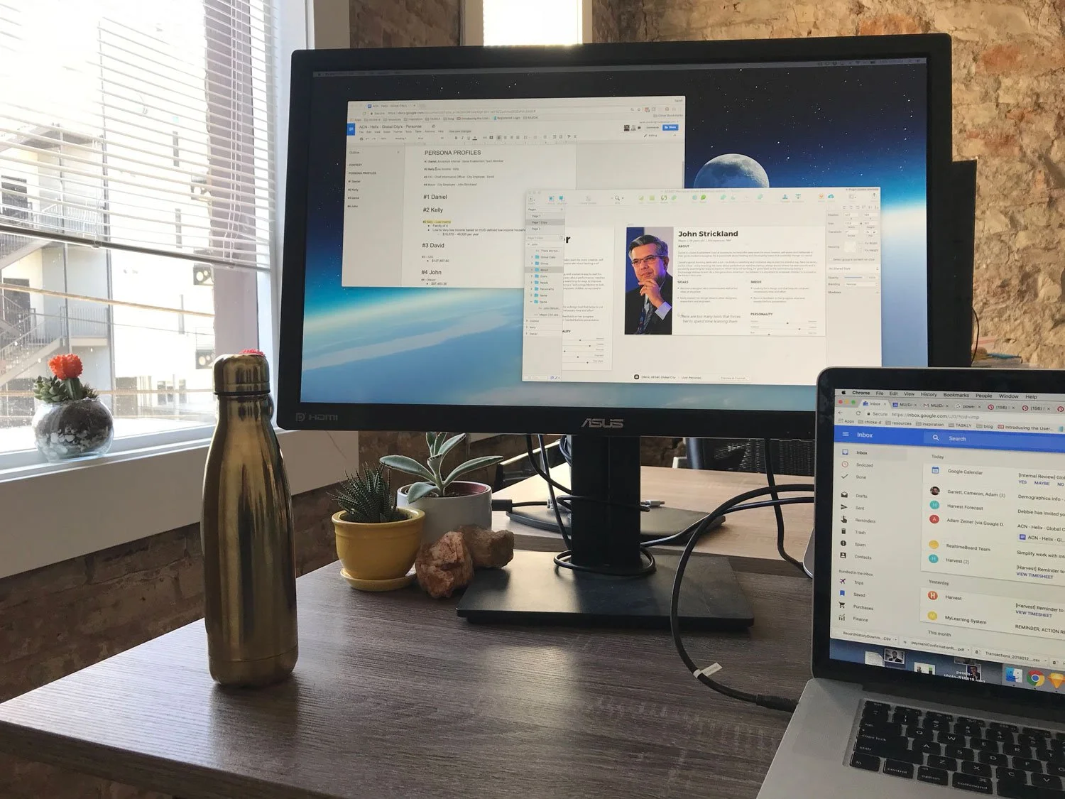
FINDING COMMON THEMES & BUILDING ARCHETYPES
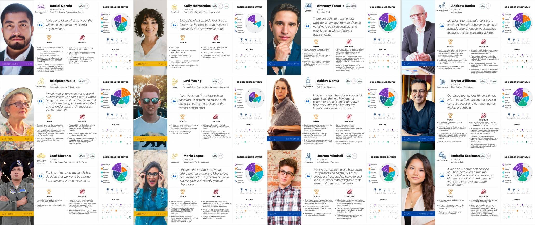
After the collaboration, we found twelve user personas that would benefit most from this product:
6 - government employees
5 - citizens
1 - client employee
CONDUCTING & ASSESSING INTERVIEWS
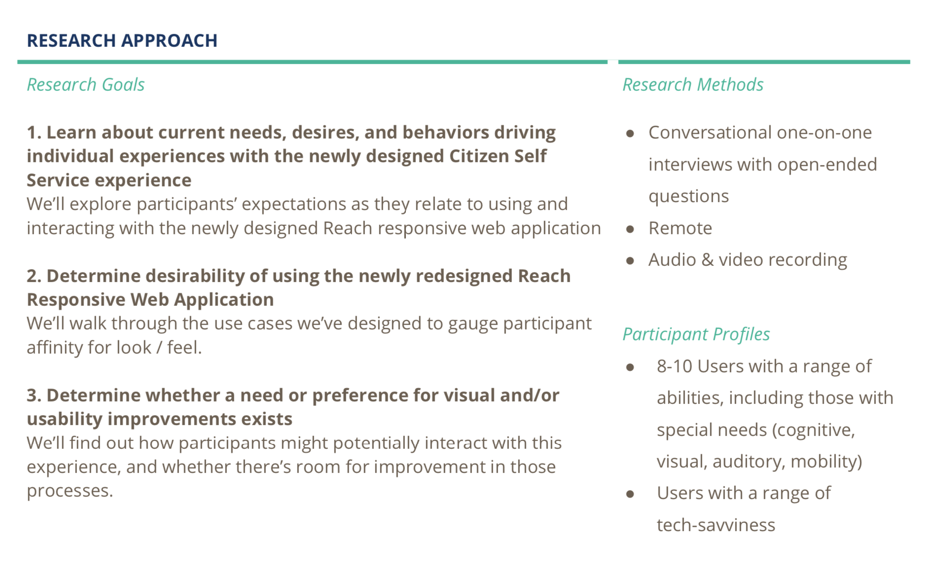
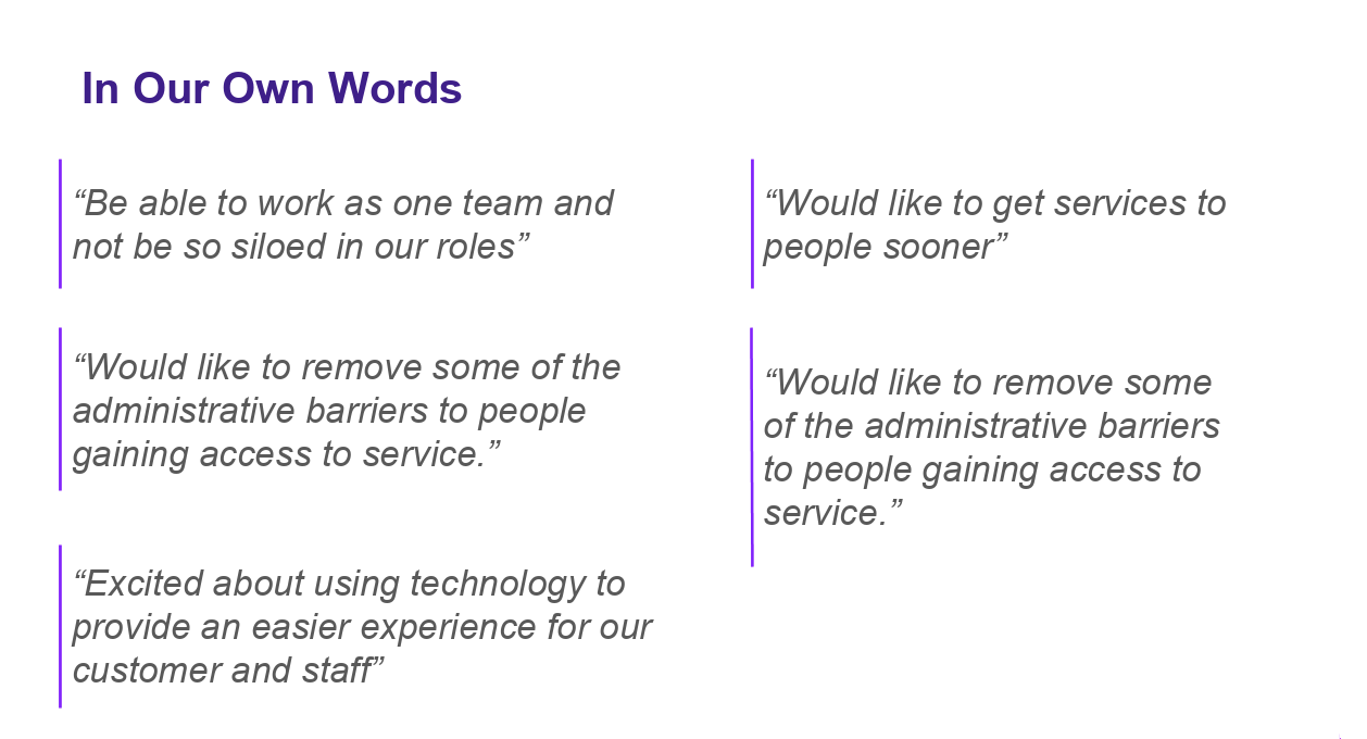
We recorded and summarized every user interview to gain an understanding of general user needs, pain points, and solutions.
REVISITING THE PROBLEM AND ANALYZING OUR COLLECTED DATA
After our workshop, research, and interviews we noticed three distinct trends:
Access and Mobility – all citizens need to be connected and have mobile access to city agencies, services and government (CASG)
Single Source of Truth - Simple, straightforward, streamlined way to interact with CASG
Access to data that can support informed decision making
FEATURE DISCOVERY
We held another workshop with stakeholders to break our features down into major epics vs minor opportunities. Beyond that we found pivotal moments within the application process to help organize where each feature belonged.
We created a list of features and epics for our minimum viable product after rating their importance, value and ease of production.
Feature List:
Mobile Friendly
Application Forms
User Accounts
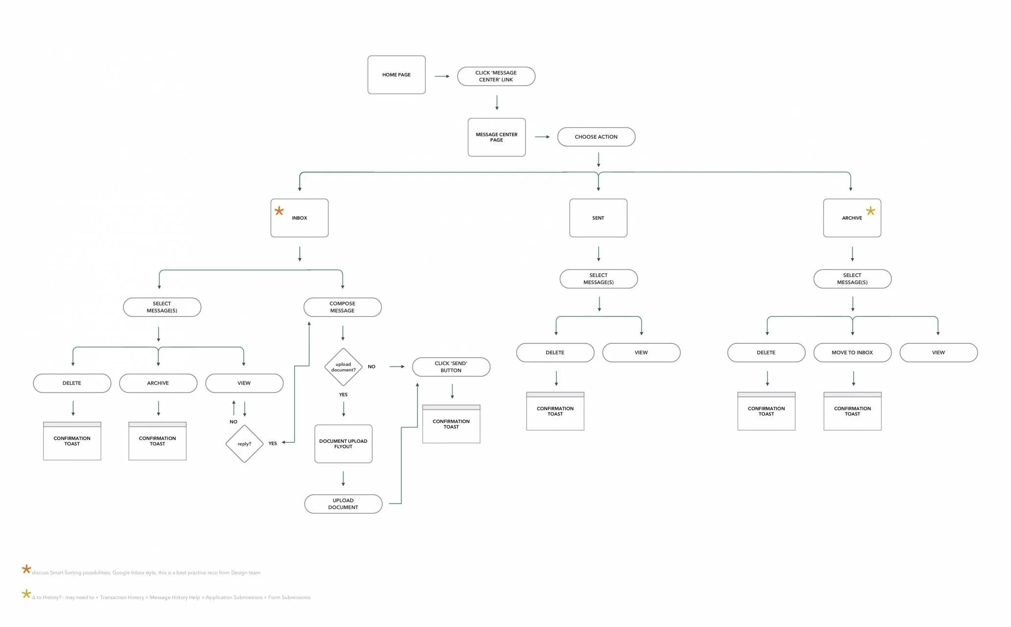
Message Center
Search and Help
TASK FLOWS
From here I created task flows and use cases based on the established features. I did this in Sprint 0 or our design baselining Sprint in order to establish the epics moving forward.
DESIGN TIME
Once we had the epics and features established, we kicked off using a dual-track agile methodology for the design and development process to ensure product delivery.
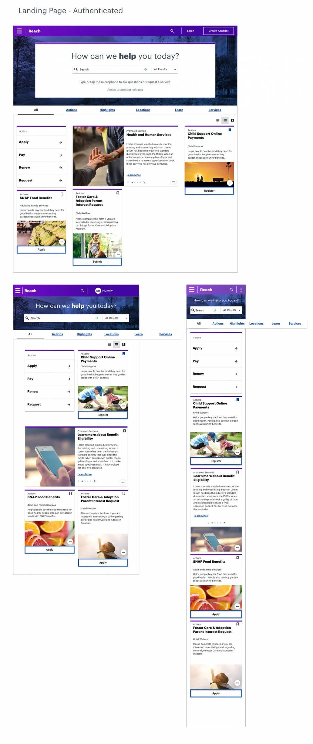
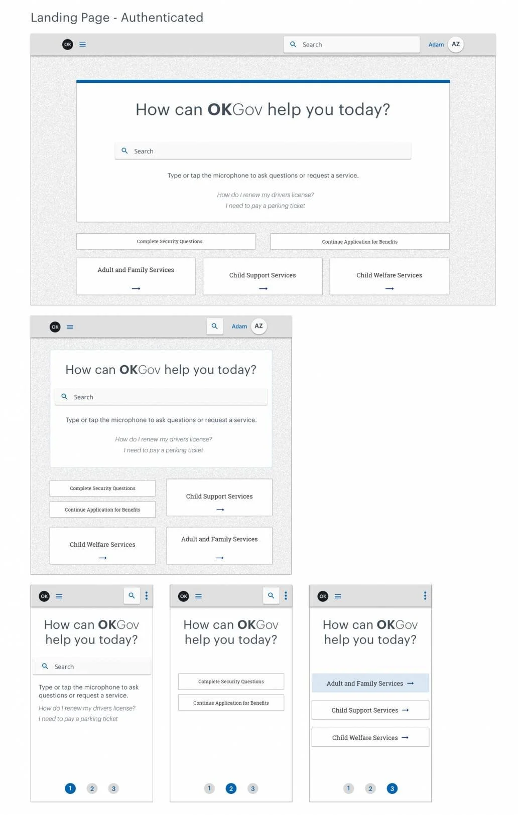
First I began with focusing on the interaction framework and wireframes, this was then tested by QA to ensure the interaction was HIPAA and ADA compliant. Once approved by QA, the UI was added and tested to ensure it met WCAG AA accessibility guidelines. Once all was approved, I worked with engineers to harden and complete the code. And then repeat with new components for the next sprint.
ESTABLISHING OUR WORKFLOW & DOCUMENTATION
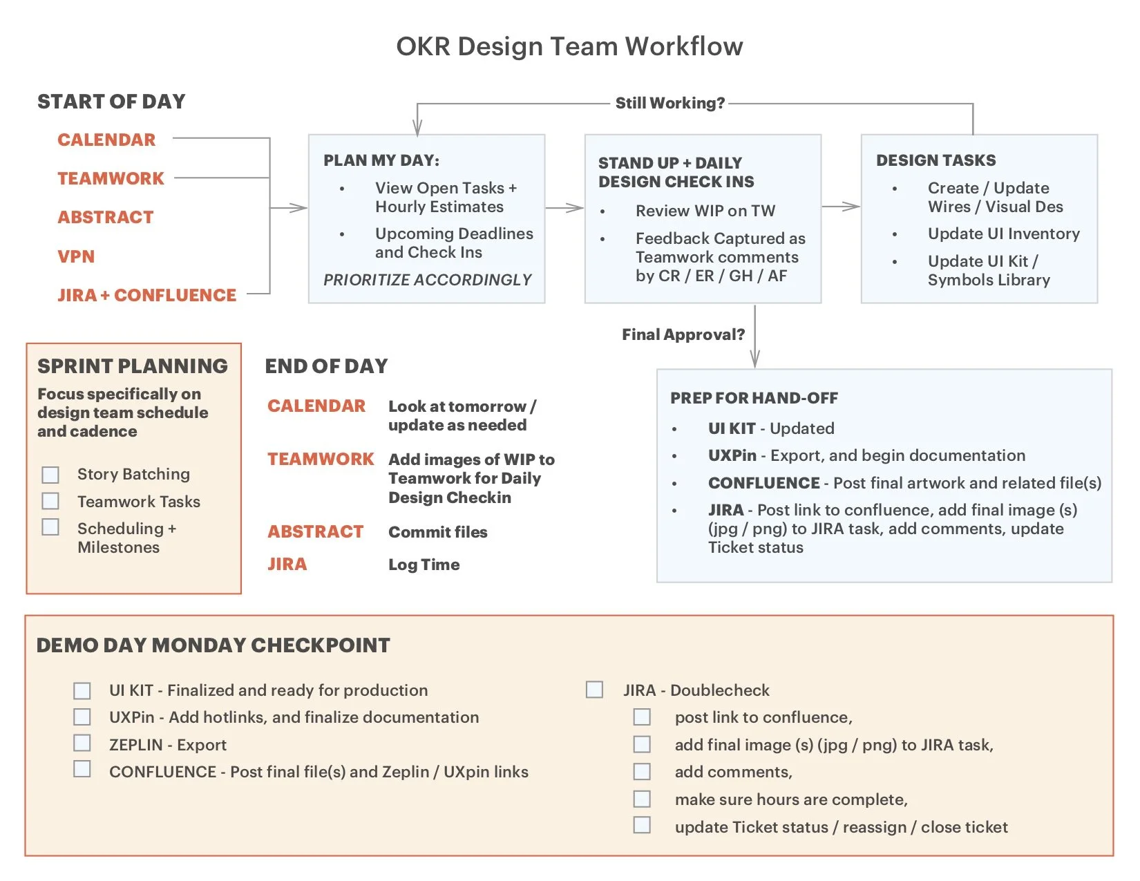
Using dual-track agile methodologies with designers and engineers took some time to smooth out and establish our cadence of working together. Once established we got into our workflow and documentation.
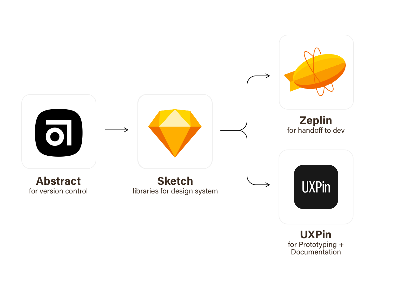
From the design side:
Abstract for our version control
Sketch to design flows, wireframes and UI, we also used a Sketch Library for our Design System
UXPin for prototyping and documentation for QA and engineers
Zeplin to handoff CSS and guidelines to engineers
BUT WAIT, HEURISTIC AUDITS!
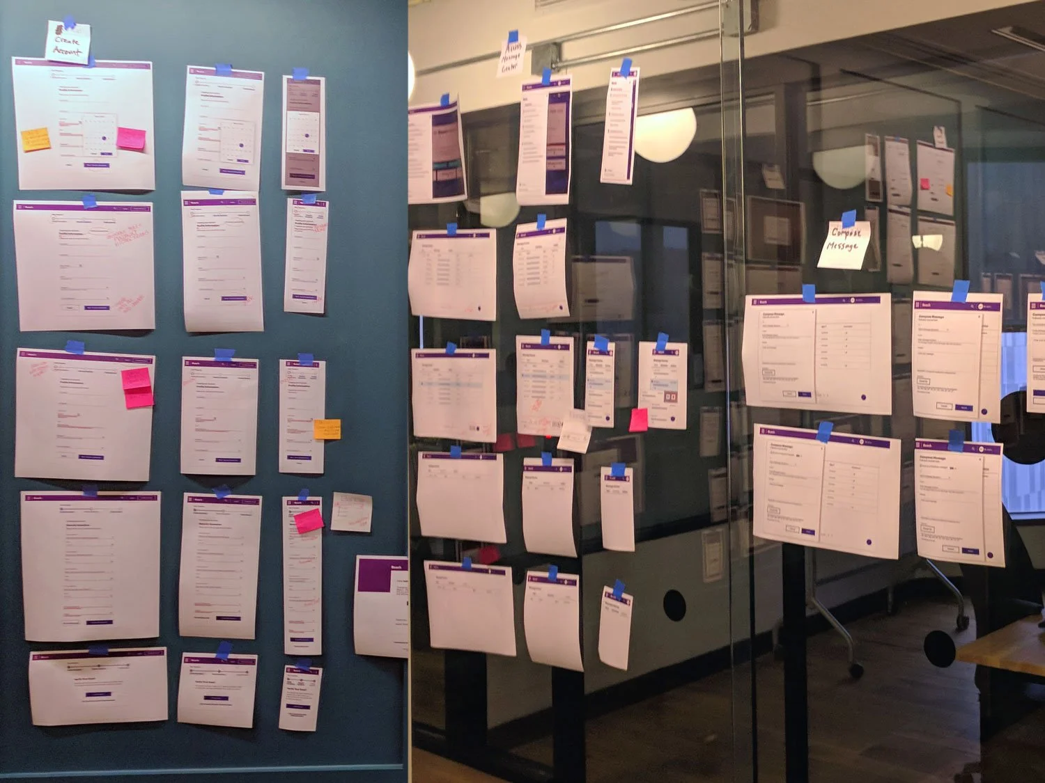
Since we had been moving at such a fast pace, we took a moment to slow down and perform an audit to identify discrepancies within the design as well as what had been currently developed. This helped improve our documentation as well as the design system going forward.
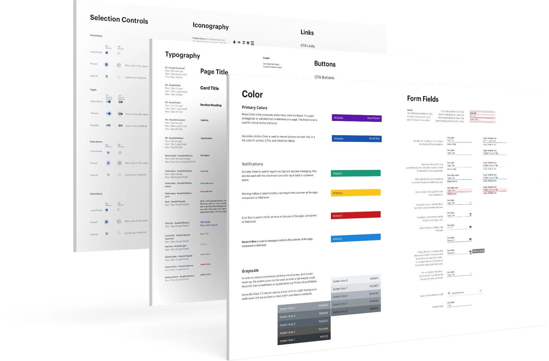
DESIGN SYSTEM
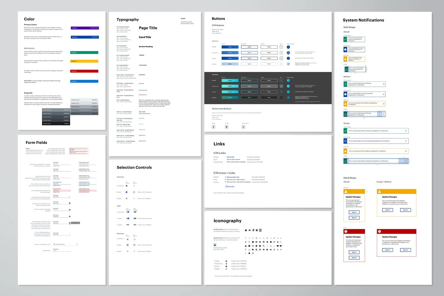
As components were built out during Sprints, the Design Pattern Library evolved and was inspired by atomic design methodologies:
Atoms
Molecules
Organisms
Templates
Pages
I designed this complex system in Sketch as a Library using nested symbols for easy overrides. This Sketch Library informed all other files.
Since this was a Proof of Concept, we didn't know much about the end client so we were inspired by the logo for Helix Labs, a partnership of Drawn + Accenture. This design system is WCAG AA compliant.
THE RESULT
There were previous short-term efforts to make a similar product but they never went to market and this product. It was a Proof of Concept demo, replete with leverageable responsive web assets. The Proof of Concept was used as a sales tool for brining prospects to the table and form a collaborative partnership as it was launched into full scale design, development, systems integration and implementation. The state of Oklahoma was the first one to sign on to use this product and customize the design system to their needs.